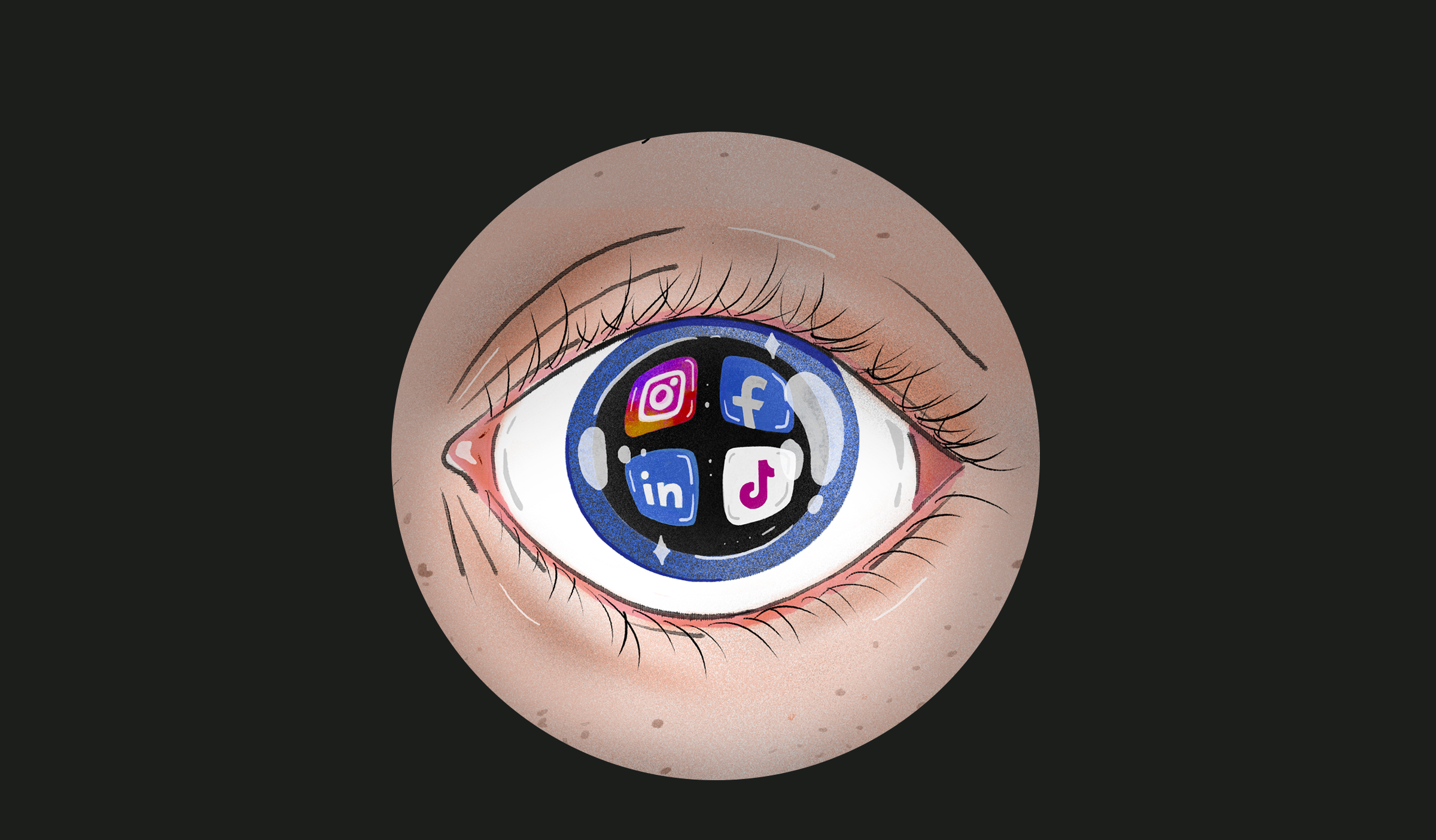
When you create content for your social media, you probably do so with an eye on reaching as many users within your target group as possible. But do you reach everyone? Here, accessibility is a key word that must be considered. This means that you create content with all types of people in mind.
But how do you do it?
Let us guide you.

What is digital accessibility?
Digital accessibility means that your digital content is meaningful and useful to as many people as possible. This means that your content must also make sense to people with a visual impairment, impaired hearing and who are neurodivergent (people whose brains potentially process information differently – for example in dyslexia, dyspraxia, autism and ADHD).
When creating content, you should keep in mind that your texts, images and videos are designed in a way that caters to all users – regardless of ability or disability – so that they can engage with the content effectively.

Is it important?
Yes, it is. And here’s why:
It benefits everyone: More people can access the content, and user-friendliness increases.
It creates better SEO: Search engines prefer user-friendly content.
It improves the way people see your brand: Accessibility can build a positive brand image, greater customer loyalty and a fairer digital environment.
It’s the right thing to do: Shows respect and gives everyone the same access to services and information.
7 tips for more accessible content
Let’s see what you can do specifically to accommodate greater accessibility. We give you 7 tips on how.

1. Use readable fonts
On social media there is almost always a certain font that you are forced to use. However, there are tools that allow you to do individual formatting. But we recommend that you don’t use it or use it sparingly. The reason for this is that the more formatting there are, the more unmanageable it becomes, and it is not possible for screen readers to read them.

2. Consider the color choice
It can be tempting to use color in your communication on social media, but if it is to be accessible, it should not be done thoughtlessly.
When using color, consider the composition of them carefully. Some color combinations could cause problems for the colorblind and other visually impaired. In general, you should go with contrasts and avoid light colors on a dark background – especially if we are talking about shades of the same basic color.

3. Image descriptions and alternative text
If your images contain more information than is already written in the text, you must specify alternative (alt) text, so that people with a visual impairment get all the necessary information.
Alt text is a concise text used to describe visual details and texts in an image that is displayed in a screen reader. Make sure to include all the things that could be relevant to the user – e.g. age and gender of persons.

4. Make use of subtitles and audio descriptions
Video is a popular format on social media, and if you use it, we often recommend that you add subtitles. In the subtitles, you can also add descriptions of background sounds, music, emotions and tone of voice.
In addition to subtitles, it is also possible to implement audio descriptions. Audio descriptions are an additional commentary track that tells what is happening on the screen between dialogues – both in the form of movements, body language, facial expressions and the like.
And don’t worry, most social media sites offer the ability to turn these things on and off so that those who need extra aids can access them, while those who don’t, they can go free.

5. Be careful with emojis
While emojis can add an interesting and personal element to your posts, be careful. Firstly, too many emojis can give a less professional look. Second, it can cause problems for screen readers and make reading the text more complicated.
Good practice is to use emojis at the end of sentences – not as bullets at the beginning of sentences and not between words or letters.
Emojis have their own Alt text, so screen readers will always read these out.

6. Hashtags with thought
With hashtags, your posts become easier to find, and you can participate in current debates and events. But as with emojis: use them wisely and preferably at the end of your post.
Make them more readable by starting each word with a capital letter:
#YourMarketingPodcast
Vs
#yourmarketingpodcast

7. Test your content
Before you post your content, sit down and go through it thoroughly. Do you use clear and inclusive language? Does the reader get the right information from the post? Sometimes it helps to read the whole thing out loud.
If you want to be sure that your posting is properly accessible, you can also seek feedback from people who have a visual impairment, impaired hearing or are neurodivergent. They can give you valuable feedback that can improve your future content availability.
It matters
Accessibility is not only relevant for users with a disability or other challenges. It is relevant to everyone. It contributes to a better digital culture and makes your content easier to understand and relate to. Perhaps not all elements can be implemented in your SoMe practice – but even a few can make a difference.