Restel is Finland’s leading player in the restaurant industry. and includes a couple of hundred restaurants across Finland. The restaurants it operates include both domestic favorites and well-known international brands. And now our long-time client got a new visual identity based on our design.
Responsible and humane
Restel had recognized the need for a renewal of the visual identity – the previous look was perceived as old-fashioned and dusty. Our client’s business has also expanded over the years, and the previous look did not support the brand in the best possible way.
We were tasked with designing an identity that supports the brand and communicates pioneering and dynamism. An important goal for the new design was to strengthen the image of Restel asa responsible and humane.


Familiar color scheme – new dynamics
All brand development work is a collaboration with Restel, including the design of the visual identity. When renewing the visual identity, it is necessary to assess how extensive changes are desired and how profitable the various measures are to implement.
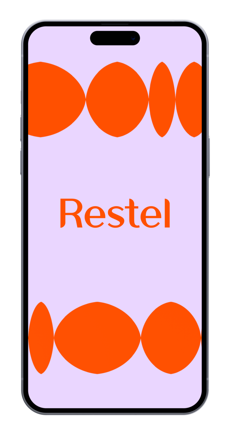
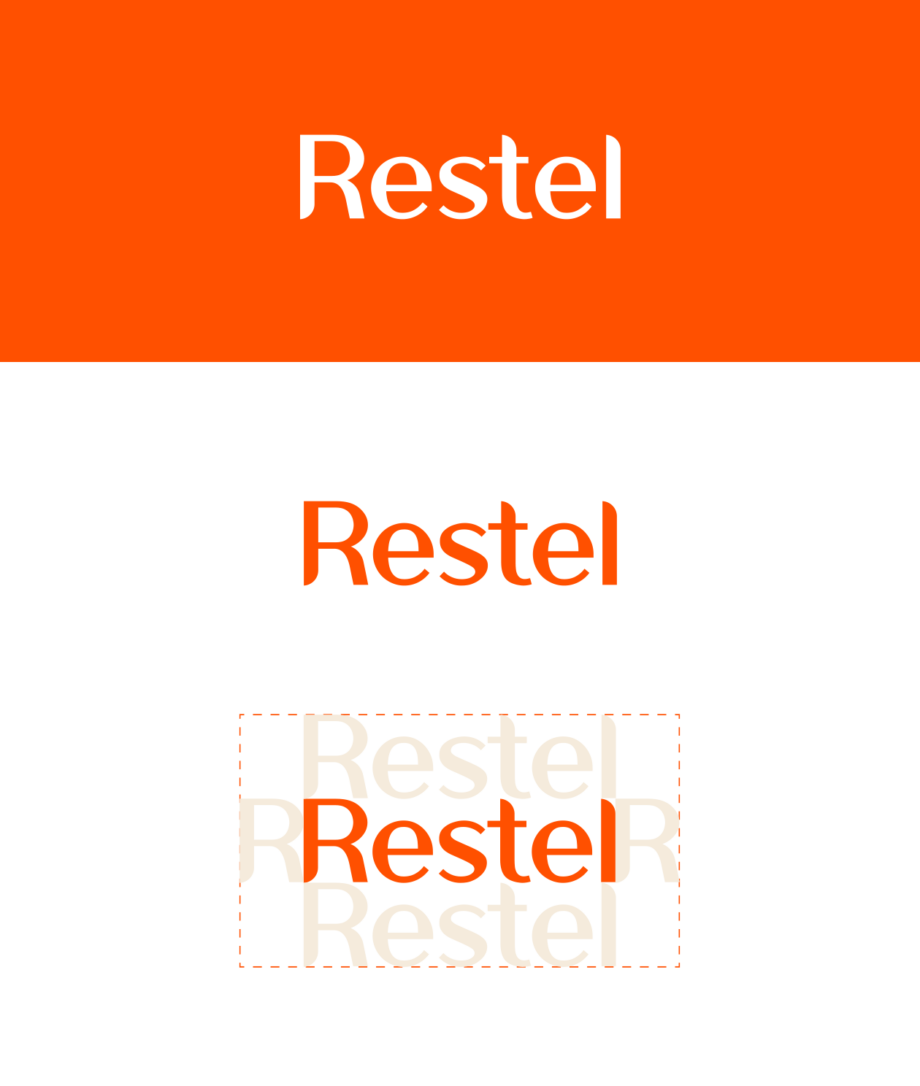
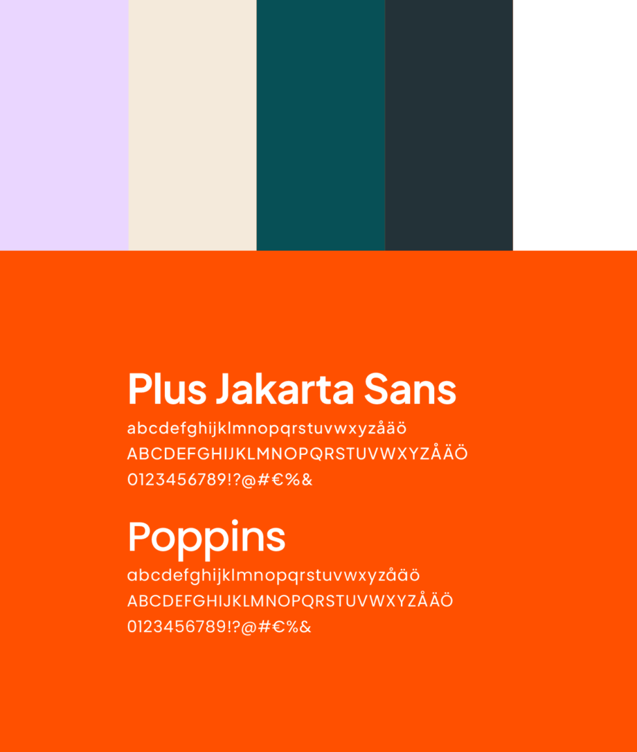
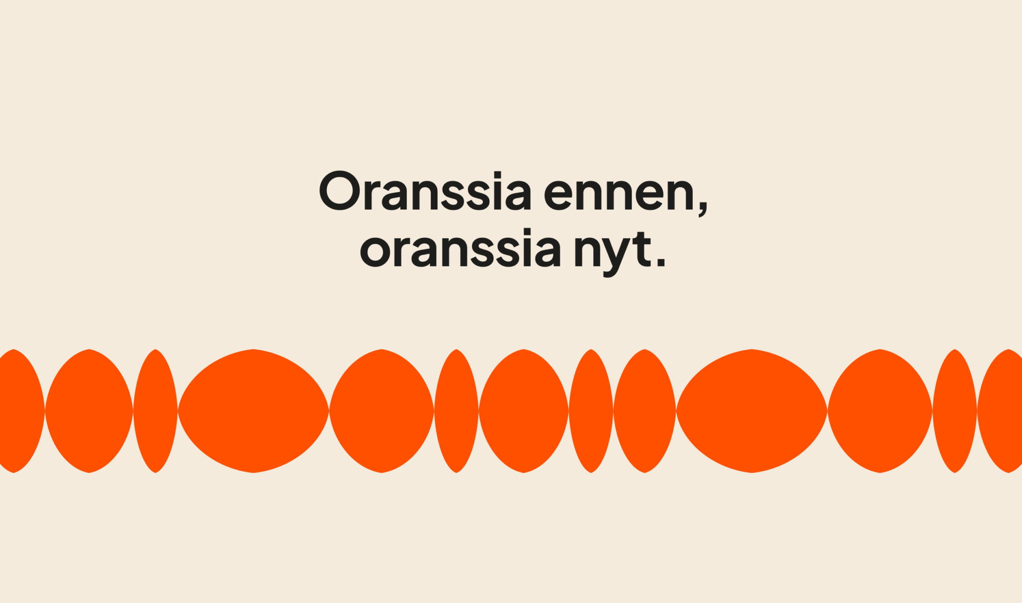
After thorough background work, discussions and experiments with the client, it was decided to keep orange as Restel’s main brand color. The color that accompanied the corporate image for a long time was perceived as part of the company’s personality. The orange shade was refined to be more dynamic and modern, and it was paired with other colors. The combinations of the main color and the colors that support it bring opportunities for more versatile, but still controlled, visual communication.
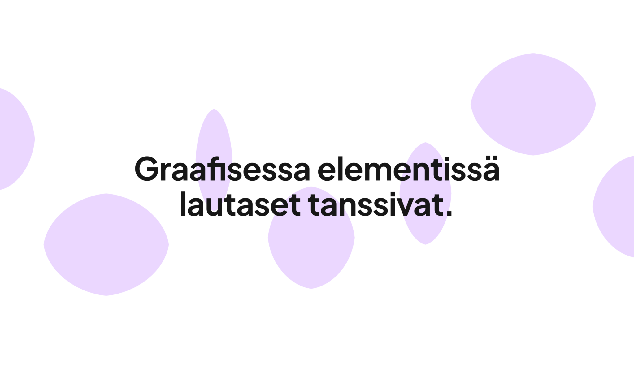
A streamlined identity
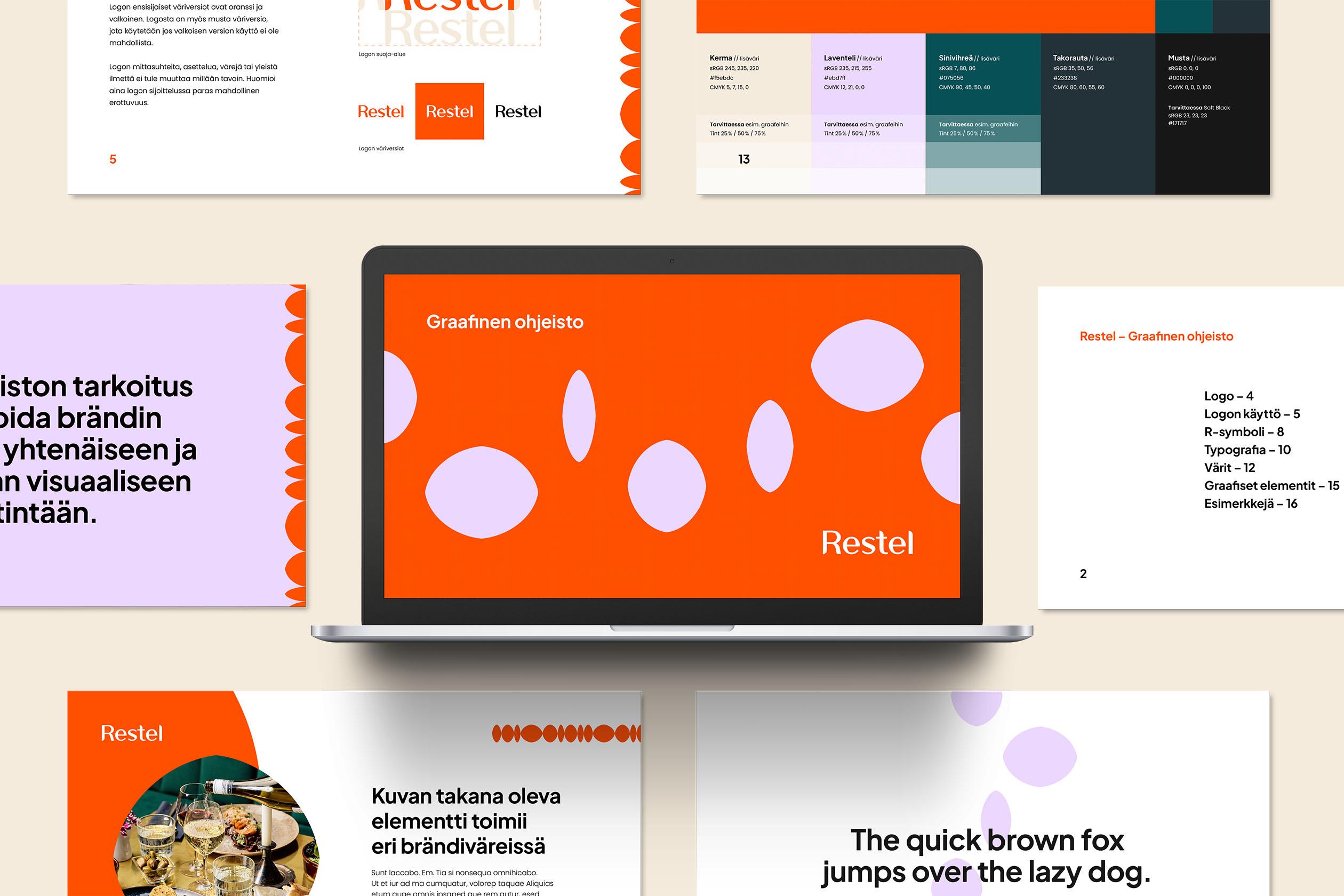
The visual identity was compiled into a graphic guide. The purpose of the guidelines is to inspire brand-appropriate, consistent and impressive visual communication.
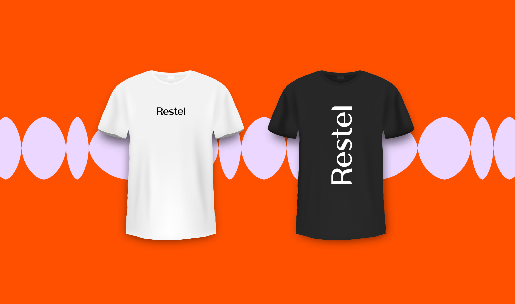
In the first phase, the visual identity was implemented in the company’s presentation templates. The design and guidelines have considered the application of the look – also in other materials and digital channels.
We were already moving away from orange as a brand color, but the Generaxion team challenged this decision with good arguments. We ended up keeping the color with a successful shade change, and the additional colors bring much-needed versatility. Additionally, the manual as an everyday tool is also exactly what we had hoped for.
Kaisa Kasila, Marketing Director (Restel)